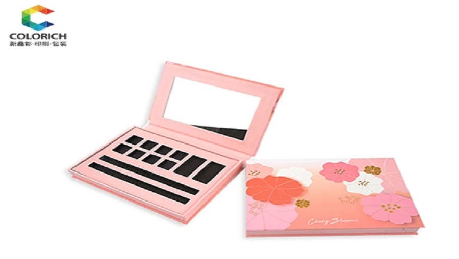

Packaging artwork plays an important role in the production of cosmetic boxes. Even an attractive design can encounter production problems if the dieline is incorrect, important text is placed too close to the cutting edge, or special printing effects are not properly specified. These issues may lead to misaligned graphics, inconsistent colors, or costly revisions before mass production.
For beauty brands, packaging designers, and procurement teams, preparing accurate artwork helps ensure that the finished packaging matches the approved design. Understanding dielines, bleed, safe zones, and print proofing is particularly important when developing custom packaging for eyeshadow palettes, lipstick boxes, blush packaging, and other color cosmetics.
This guide explains how to prepare packaging artwork, avoid common design errors, and coordinate with a packaging manufacturer before production begins.
A dieline is a technical layout showing how a packaging structure will be cut, folded, and assembled. It helps designers position graphics correctly on the different panels of a box.
A typical dieline may include:
Cut lines: Indicate where the material will be cut.
Fold lines: Show where the packaging will bend or fold.
Bleed areas: Extend artwork beyond the final cutting boundary.
Safe zones: Identify areas where important text and graphics should remain.
Glue areas: Indicate where adhesive may be applied during assembly.
Designers should use the dieline supplied or approved by the packaging manufacturer rather than creating structural dimensions based only on a visual mockup.
For custom cosmetic boxes, the dieline must correspond to the actual box structure, material thickness, and production method. A small change in dimensions or folding arrangement can affect how the artwork appears after assembly.
Before designing the final layout, confirm the box dimensions, panel arrangement, opening direction, and any insert requirements with the supplier.
Understanding these three elements helps prevent common printing and cutting errors.
Bleed is the additional artwork extending beyond the intended trim line. It helps prevent unwanted white edges if the cutting position varies slightly during production.
For example, if a box panel has a full-color background extending to its edge, the background should continue into the specified bleed area.
The required bleed depends on the manufacturer's production specifications, so designers should confirm the correct measurement before exporting the artwork.
Trim lines indicate where the printed material will be cut. Important design elements should not be placed directly across these lines unless the structural design specifically requires it.
Designers should also check that graphics crossing multiple panels align correctly after folding and assembly.
Safe zones keep essential text, logos, barcodes, and other important elements away from cutting and folding boundaries.
For cosmetic packaging, this is particularly important for product names, shade numbers, ingredient information, and regulatory text. The safe-zone distance should follow the approved dieline and supplier specifications.
Artwork quality depends on more than the layout itself. The files and assets used in the design must also be suitable for the intended printing process.
Use high-quality original logo files whenever possible. Vector artwork is generally useful for logos and text-based graphics because it can be scaled without the same resolution limitations as raster images.
Photographs and raster images should have sufficient resolution for their final printed size. Enlarging a low-resolution image may produce blurred edges or visible pixelation.
Fonts should be handled according to the designer's software and the manufacturer's file requirements. Outlining fonts or packaging the required font files can help avoid unexpected font substitutions, provided the final files remain suitable for editing and production approval.
Review small text carefully, particularly on compact lipstick boxes or eyeshadow packaging where space is limited.
If a barcode is required, verify its dimensions, contrast, placement, and readability requirements. Avoid placing it across folds or heavily textured areas that may interfere with scanning.
Ingredient lists, product names, shade identifiers, and other required information should be checked against the brand's approved copy before the artwork is released.
The printing process and decorative finishes can affect how the final packaging looks. Designers should communicate these requirements clearly in the artwork and production notes.
Common options include:
CMYK printing: Commonly used for full-color graphics and photographs.
Pantone spot colors: Useful when a project requires specified brand colors, subject to the printing method and material.
Foil stamping: Adds metallic or other foil effects to selected areas.
Embossing and debossing: Creates raised or recessed surface details.
Matte and gloss finishes: Changes the surface appearance and visual contrast.
During cosmetic box printing, special finishes may require separate production layers or clearly marked areas on the artwork. Designers should follow the supplier's instructions for naming, preparing, and submitting these elements.
Color appearance can also vary depending on the substrate, coating, printing process, and lighting conditions. A screen preview alone cannot guarantee that the printed result will match the designer's expectations.
For this reason, request an appropriate print proof or physical sample when color accuracy, special finishes, or structural appearance is important.
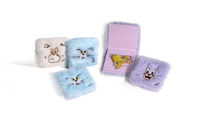
Effective makeup packaging design balances visual appeal, product information, and manufacturing requirements.
For example, an eyeshadow palette may require a larger printed surface for shade names and brand graphics, while a lipstick box may need a compact layout with clear product identification. A blush package may require particular attention to the placement of shade information and the fit of the internal insert.
Designers should consider the finished package rather than reviewing the flat artwork alone. Elements that look well spaced on a computer screen may appear crowded after folding or assembling the box.
For color cosmetic packaging, review the following before approving production:
Logo placement and brand color consistency.
Text readability at the final printed size.
Alignment across panels and folds.
The position of shade names, barcodes, and product information.
The appearance of special finishes on the selected material.
The fit between the outer box and the cosmetic product or insert.
A three-dimensional mockup can help review the visual layout, while a physical sample provides more useful evidence of the actual material, assembly, and finishing quality.
A final artwork review should involve both the brand and the packaging supplier.
Use the following checklist before authorizing mass production:
Confirm that the dieline matches the approved packaging structure.
Verify bleed, trim lines, safe zones, and fold positions.
Check spelling, product names, shade identifiers, and required information.
Confirm image resolution, font handling, and barcode placement.
Verify the specified printing method, colors, and special finishes.
Review the assembled mockup or physical proof where appropriate.
Confirm that all revisions have been incorporated into the final approved file.
These steps form a practical part of cosmetic packaging artwork solutions, helping brands and suppliers coordinate the transition from graphic design to physical production.
If structural changes or new finishing requirements are introduced after artwork approval, the file may need to be revised and checked again before manufacturing begins.
Preparing accurate cosmetic packaging artwork requires coordination between graphic design, structural engineering, printing, and production. Correct dielines, suitable bleed, clear safe zones, high-quality assets, and careful proof approval can help reduce errors and avoid unnecessary revisions.
For beauty brands developing custom packaging, the most reliable approach is to confirm the manufacturer's specifications early, review the artwork in both flat and assembled formats, and obtain approval before mass production.
A structured artwork checklist helps ensure that the finished cosmetic box reflects the intended brand identity while meeting practical manufacturing requirements.
A dieline is a technical layout showing cutting lines, folding lines, and other structural details used to produce and assemble a packaging box.
Bleed is the extra artwork extending beyond the final trim line. It helps prevent unwanted unprinted edges caused by small variations in cutting position.
Safe zones help protect important information from being cut off, folded over, or positioned too close to an edge. They are particularly useful for logos, product names, shade numbers, and small text.
A physical sample is particularly valuable when the project involves specific colors, structural requirements, special finishes, or product inserts. It allows the brand to assess the actual packaging before approving production.
Provide clear color specifications, confirm the intended printing process and material, and review an appropriate proof or sample. Screen colors alone cannot guarantee an identical printed appearance.
Typical requirements include the approved dieline artwork, logo files, linked images, font information where needed, color specifications, and instructions for special finishes. The exact file format and submission requirements should be confirmed with the manufacturer.

Hey,I'm Rachel Liao,the sales manager of Colorich Packaging.
With solid professional skills and acute market insight, focus on providing customers with customized packaging solutions and supply chain optimization services.
●Packaging demand analysis and solution design
●Customer development and long-term relationship maintenance
●Cost optimization and sustainable packaging practices

 en
 English
 日本語
 한국어
 français
 Deutsch
 Español
 italiano
 русский
 português
 العربية